
Lesson 5: Tuning Your Data for Weather
Remember that in this sample Project, we wish to see the savings, if any, from changes made to the building’s controls and HVAC equipment. To do this, the current monthly utility bills need to be calculated as if no changes were made. This is called the building’s baseline. The difference between the baseline and the actual bills are the actual savings.
Creating, or tuning the baseline is a process which combines your judgment with a statistical analysis to establish the relationship (if any) between historic utility performance and weather or other variables. The end result of tuning is a set of coefficients which Metrix uses each month to calculate what the utility bill would have been if no changes were made to the facility.
Metrix 4 can automatically tune the meters so you do not have to, but it is our belief that you are better off understanding the steps of tuning and some of the theory behind it so that a judgment can be made whether or not the automatic tuning algorithm is on the mark. Sometimes automatic tuning will not give the best results. For this reason, it is suggested that the steps in this tutorial are followed to get an idea of what Metrix is doing when it auto-tunes.
In the sample Project, the building has water and space heating equipment fueled by natural gas, so it is likely that the natural gas meter shows a relationship to heating degree-days, but we will look at the data to make sure.
1. Click on the Meter Item named Primary Gas.
2. Click on the Tuning Tab, to show the Meter’s tuning screen shown in Figure 2.22.
3. First, the bills included in the tuning period must be specified. Because we want to tune for the first 12 bills, enter 12 bills, starting at 1 in the Tuning Period fields.
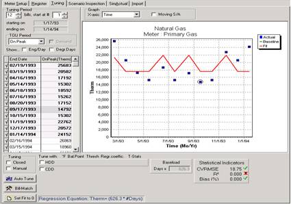
Figure 2.22: Baseline Tuning Data Form
4. Make sure the Moving S/A check box at the top of the window is cleared. Also, clear the Manual check box in the lower left of the window. For the X-axis, select Time in the list. The graph displays 12 blue boxes, which plot the actual Therms usage for each bill over time. The red fit line simply shows the resulting average daily usage, unadjusted for any variables like weather.
Now we can take a look to see if there is a relationship between natural gas usage and weather by graphing the outcome of weather conditions on usage below:
5. For the Graph X-axis as shown in Figure 2.23, select Outdoor Temp (temperature).
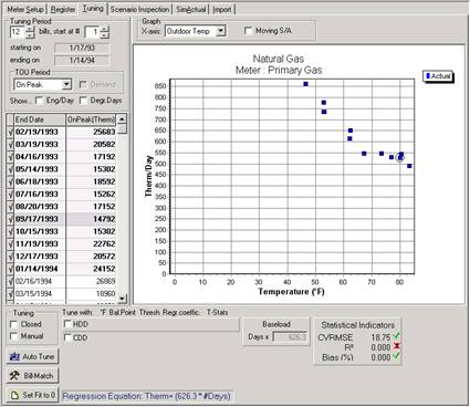
Figure 2.23: Graphing The X-Axis: Outdoor Temp Vs. Gas Usage
The first 12 utility bills charted against the average temperature experienced during the billing period are shown on the graph in Figure 2.23. Each blue square represents a utility bill. Do you notice any trends? It appears that at any temperature above 67 degrees F, usage remains relatively constant. We can assume that if the average temperature for a billing period was 90 degrees F, the average usage per day would remain at about 550 therms. Also notice that usage climbs for billing periods in which average temperature is below 67 degrees F. The colder it is outside, the more gas is used. This graph indicates two things:
Gas is used to heat, not cool the building
67 degrees F seems to be the building’s balance point temperature.
6. Since we have decided that gas tunes for heating and not cooling, we need to see how well gas usage correlates to heating degree-days. To do this, change the Graph X-Axis to Heating DD, as in Figure 2.24. Then in the lower part of the tuning form, select the check box to the immediate left of the label “HDD.” This instructs Metrix to perform a linear regression of gas usage versus heating degree-days. Now change the Heating Balance Point to 67 degrees F, since that is our initial guess of what the balance point should be.
7. Note the R2 value is greater than 0.900, which is good. The cooling balance point temperature can be modified to maximize the R2 value. Try to find the balance point that results in the R2 closest to 1.0.
8. We found that a Heating Balance Point of 66 degrees F yielded the highest R2 value, so we finished with a heating balance point of 66 degrees F.
9. If green checkboxes are seen next to several statistical indicators, and also next to the meter in the tree diagram, the graph is indicating that your tuning has met the criteria for an effective tuning. If red X’s are shown, Metrix is indicating that your tuning is not meeting the criteria.
10. If desired, the X axis can be switched to Time to see how well the best fit line, in red, corresponds to the actual bill data, which are the blue boxes.
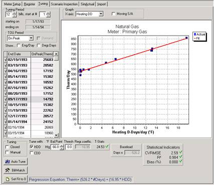
Figure 2.24: Best-Fit Line (Red) as Related to Heating Degree Days
11. Double-click the Primary Elec Meter Item. We wish to use the same Tuning Period as the gas meter, which was roughly 1993. So select 12 electricity bills, starting at 6.
12. Select the Outdoor Temp as your X-axis as in Figure 2.25 and determine the balance point. Determining the balance point for this meter is not nearly as easy. It is hard to tell what the usage would have had the average temperature been 20 degrees F. Still, we can tell that the meter is used for cooling, since when the average outdoor temperature rises, so does electricity usage. The balance point is probably somewhere between 53 degrees F and 59 degrees F.
13. Since we have decided that electricity tunes for cooling and not heating, we need to see how well electricity usage correlates to cooling degree-days. To do this, change the Graph X Axis to Cooling DD. Then select the check box to the left of the label CDD. This instructs Metrix to perform a linear regression of electricity usage versus cooling degree-days. Now, change the Cooling Balance Point to 53 degrees F, since that is our initial guess of what the balance point should be.
14. Note the R2 value is greater than 0.900, which again is very good. The cooling balance point temperature can be modified to maximize the R2 value. Try to find the balance point that results in the R2 closest to 1.0.
15. We found that a Cooling Balance Point of 60 degrees F yielded the highest R2 value, so we finished with a cooling balance point of 60 degrees F.
16. If desired, the X-axis can be switched to Time. Note how well the best-fit line, in red, corresponds to the actual bills, which are blue boxes.
17. Most of these steps can be skipped, and the meter can be automatically tuned by clicking on the Auto-Tune button.
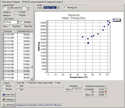
Figure 2.25: Primary Electric Usage Comparison to Outdoor Temp
18. Demand to the weather, if appropriate, can also be correlated. Select the Demand check box in the upper left corner of the data form. Again, note the outdoor temperature graph, or make the assumption that since kWh is sensitive to cooling degree-days, demand should similarly be sensitive to cooling. There are some exceptions to this however. Again maximize the R2 value by changing the cooling balance point. Usually, the kWh and kW need not share the same balance point.